Modern Flutter dashboards often contain a large amount of information—settings, analytics panels, FAQs, logs, forms, and documentation. Displaying all of this data at once can quickly make the interface cluttered and difficult to navigate.
This is where an accordion UI component becomes extremely useful.
An accordion allows sections of content to expand and collapse dynamically, enabling users to focus only on the information they need. In a Flutter dashboard, accordions are commonly used for FAQ sections, settings panels, documentation lists, and expandable data views.
In this article, we will explore:
- What an accordion is in UI design
- Why accordions are important in Flutter dashboards
- How to implement an accordion widget in Flutter
- Best practices for accordion UI in dashboards
- Example implementation using Flutter widgets
By the end of this guide, you will understand how to build a clean, scalable, and user-friendly accordion component for Flutter dashboards.
What is an Accordion UI Component?
An accordion is a vertically stacked list of items where each item can be expanded or collapsed to reveal additional content.
Each accordion item typically contains two parts:
- Header / Title – the clickable section
- Content / Body – the expandable content area
When the user clicks the header, the content becomes visible. Clicking it again collapses the section.
Accordion interfaces are widely used because they:
- Reduce visual clutter
- Organize content hierarchically
- Improve readability
- Save screen space
In Flutter dashboard applications, accordions are particularly useful when dealing with large datasets or documentation.
Why Use Accordion in a Flutter Dashboard?
Dashboards typically contain dense information. Without proper structure, the UI becomes overwhelming.
Using accordion widgets in Flutter dashboards provides several benefits.
1. Better Information Hierarchy
Accordions help group related information.
For example:
- User settings
- System configuration
- Analytics filters
- Documentation sections
Each section can be collapsed until needed.
2. Improved User Experience
Users prefer interfaces that allow them to focus on specific content without distractions.
Accordions:
- Reduce scrolling
- Make navigation easier
- Provide progressive disclosure of information
3. Efficient Space Management
Dashboard interfaces often run inside limited containers such as cards or panels.
Accordion components allow developers to fit large amounts of content in small areas.
4. Perfect for FAQ Sections
Many dashboards include support documentation or FAQs.
Accordion UI is widely used for:
- Help centers
- Documentation pages
- Troubleshooting guides
For example, your Flutter dashboard demo:
Both demonstrate practical accordion usage inside a modern UI.
Basic Structure of an Accordion in Flutter
An accordion component usually consists of three main parts:
- Accordion widget
- Accordion items
- Expandable content
Conceptually, the structure looks like this:
Accordion
 ├─ AccordionItem
 │   ├─ Title
 │   └─ Content
 ├─ AccordionItem
 │   ├─ Title
 │   └─ Content
Each item manages its own expanded or collapsed state.
Implementing Accordion in Flutter
Let’s look at a practical implementation of an accordion component in a Flutter dashboard.
Below is an example using a custom Accordion widget with AccordionItemData.
Flutter Accordion Example
Accordion(
  items: [
    AccordionItemData(
      title: "What is Flutter?",
      content: const Text(
        "Flutter is an open-source UI software development toolkit created by Google. It is used to develop applications for Android, iOS, Linux, Mac, Windows, and the web from a single codebase.",
      ),
    ),
    AccordionItemData(
      title: "How to get started with Flutter?",
      content: const Text(
        "To get started with Flutter, you can install the Flutter SDK and set up your development environment. Visit the official Flutter website for installation instructions and tutorials.",
      ),
    ),
    AccordionItemData(
      title: "What is Dart?",
      content: const Text(
        "Dart is a client-optimized programming language for apps on multiple platforms. It is the language used to write Flutter apps, providing features such as hot reload and a rich set of libraries.",
      ),
    ),
    AccordionItemData(
      title: "What is hot reload in Flutter?",
      content: const Text(
        "Hot reload allows developers to see the changes made in the code instantly reflected in the app without restarting it. This feature significantly speeds up the development process.",
      ),
    ),
    AccordionItemData(
      title: "Where can I find Flutter documentation?",
      content: const Text(
        "The official Flutter documentation can be found at https://flutter.dev/docs. It includes guides, API references, and other resources for developers.",
      ),
    ),
  ],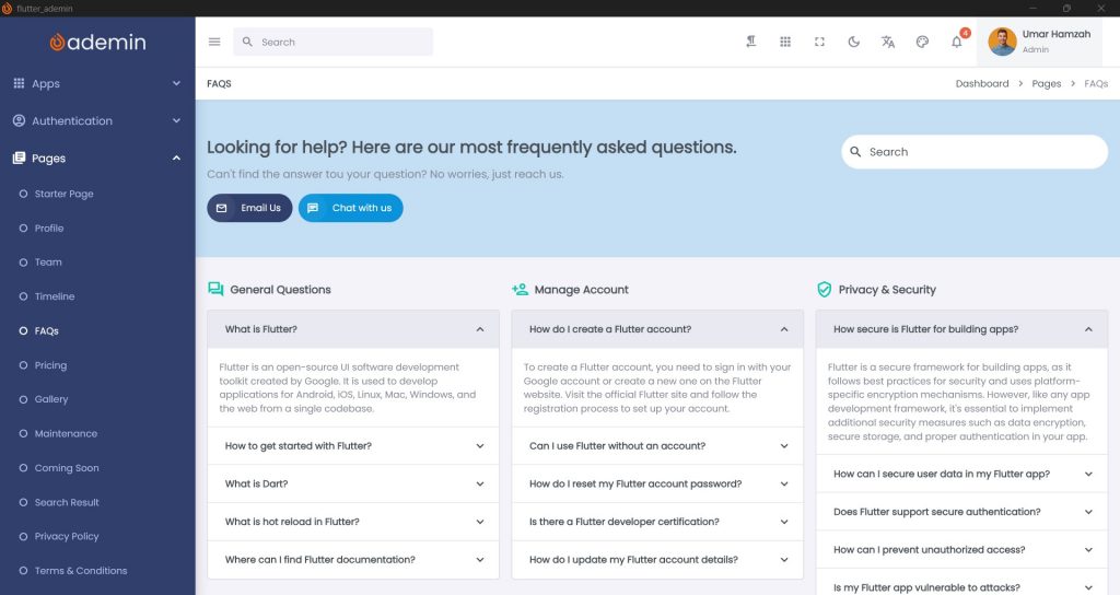
)This example creates a Flutter FAQ accordion containing multiple expandable items.
Each item consists of:
title→ accordion headercontent→ widget displayed when expanded
How Accordion Improves Flutter Dashboard UI
Let’s look at real dashboard use cases.
1. FAQ Section
One of the most common accordion use cases.
Example:
What is Flutter?
How to install Flutter?
How to deploy Flutter apps?
Each question expands to reveal the answer.
2. Settings Panel
Dashboards often include dozens of configuration options.
Instead of displaying everything at once, you can group them:
- Account Settings
- Notification Settings
- Security Settings
- System Preferences
Each section can be collapsed until needed.
3. Analytics Filters
Accordion widgets can hide advanced filters.
Example:
Filter Options
 ├─ Date Range
 ├─ Region
 ├─ Product Category
 └─ User Segment
This prevents dashboards from becoming cluttered.
4. Documentation Panels
If your dashboard includes documentation, accordions help organize topics.
Example:
- Getting Started
- Installation Guide
- API Documentation
- Troubleshooting
Best Practices for Accordion UI in Flutter Dashboards
Implementing an accordion is easy, but designing it well requires attention to usability.
Here are some best practices.
1. Keep Titles Clear and Concise
Accordion headers should clearly describe the content inside.
Good examples:
✔ “User Authentication Settings”
✔ “Payment Configuration”
✔ “Notification Preferences”
Avoid vague titles like:
✖ “Details”
✖ “More Info”
2. Limit Content Size
Large blocks of text inside an accordion can reduce readability.
Instead:
- Break content into paragraphs
- Use bullet points
- Add icons or lists
3. Use Icons for Visual Feedback
Accordion headers often include icons such as:
- arrow_down
- arrow_right
- expand_more
- expand_less
These indicators help users understand whether the section is expanded.
4. Support Single or Multiple Expansion
Two accordion behaviors exist.
Single Expansion
Only one item can be open at a time.
[Open]
Item 1

[Closed]
Item 2
Item 3
This works well for FAQs.
Multiple Expansion
Several sections can stay open simultaneously.
This is useful for:
- Settings panels
- Documentation sections
5. Use Animation
Animations improve perceived performance and usability.
Flutter makes this easy using widgets like:
AnimatedContainerAnimatedSizeExpansionPanelList
Smooth transitions make dashboards feel more polished.
Styling Accordion for a Modern Flutter Dashboard
To match modern dashboard design systems, accordion widgets should follow UI best practices.
Common styling features include:
- Rounded corners
- Subtle shadows
- Hover effects
- Divider lines
- Padding consistency
Example styling ideas:
Card
 ├─ Accordion Header
 │   ├─ Title
 │   └─ Expand Icon
 └─ Accordion Content
This layout works well inside Flutter admin dashboards.
Performance Considerations
When implementing accordion components in Flutter dashboards, keep performance in mind.
Lazy Rendering
Avoid rendering heavy widgets until the accordion expands.
Widget Reuse
Use reusable components such as:
Accordion
AccordionItem
AccordionHeader
AccordionContent
This improves maintainability.
Advanced Accordion Features
For large-scale dashboards, accordion components can support additional features.
1. Searchable Accordion
Useful for documentation or FAQ pages.
Example:
Search FAQ...The accordion automatically filters matching items.
2. Nested Accordions
Sometimes accordion items contain another accordion.
Example:
Settings
 ├─ Security
 │   ├─ Password Policy
 │   └─ Two-Factor Authentication
 └─ Notifications
This structure works well for complex dashboards.
3. Dynamic Accordion Data
Accordion items can be generated from APIs or databases.
Example:
List<AccordionItemData> faqItems = fetchFaqFromApi();This is common in enterprise Flutter dashboards.
Real Demo Example
You can see a working accordion example here:
Demo UI Accordion
https://ademin.flutkit.com/#/ui-accordion
Demo FAQ Page
https://ademin.flutkit.com/#/faqs
These examples demonstrate how accordion widgets help structure content in a modern Flutter dashboard UI.
When Not to Use an Accordion
Although accordion widgets are powerful, they should not be overused.
Avoid accordions when:
- Content is very short
- Users need to compare sections side-by-side
- Important information must always remain visible
In those cases, cards or tabs may work better.
Accordion vs Tabs in Flutter Dashboards
Developers often ask whether to use tabs or accordion.
Here is a quick comparison.
| Feature | Accordion | Tabs |
|---|---|---|
| Content visibility | Multiple sections | One section |
| Space efficiency | High | Medium |
| Best for | FAQs, settings | Navigation |
| Interaction style | Expand / collapse | Switch views |
Both patterns are useful depending on the situation.
Conclusion
Accordion components are an essential UI pattern for building clean and scalable Flutter dashboards. They help organize large amounts of content while maintaining a simple and intuitive interface.
By using accordion widgets in Flutter, developers can:
- Reduce UI clutter
- Improve readability
- Provide better content hierarchy
- Enhance user experience in dashboards
Whether you’re building FAQ sections, configuration panels, documentation pages, or analytics filters, accordion components provide a flexible and efficient solution.
With proper design, animation, and structure, accordions can significantly improve the usability of modern Flutter admin dashboards.
If you are building dashboard templates or UI systems—like FlutKit dashboards—a well-designed accordion component becomes a reusable building block across multiple pages.
By integrating accordion widgets thoughtfully, you can create powerful, responsive, and professional Flutter dashboard interfaces.