Working with UI Widgets in FlutKit
FlutKit Dashboard UI Kits provides a rich library of ready-to-use Flutter UI widgets / components designed to help developers build dashboards and applications rapidly. Each component is fully customizable and follows consistent design tokens (colors, spacing, typography) to maintain uniformity across your product.
To simplify learning and adoption, the FlutKit Dashboard UI Kits Demo includes an interactive UI Widgets Showcase. Every component page includes a Show code toggle that reveals the exact Flutter implementation used to render the component.
This allows developers to copy, paste, and immediately use the widget in their own applications.
How the “Show code” Feature Works
Inside the FlutKit Dashboard UI Kits Demo, each UI element (e.g., Buttons, Cards, Badges, Tabs, Alerts, etc) includes:
- A visual preview of the component.
- A Show code switch.
- A syntax-highlighted code block containing the actual widget code.
When you toggle Show code, the UI switchs and displays the the source widget, including its parameters and recommended usage pattern.
This makes it straightforward to adopt any UI component by simply copying the code snippet and importing the widget into your screens.
Steps to Use a UI Component from FlutKit
Step 1 — Browse the UI Component in the FlutKit Demo
Navigate to:
Base UI → Buttons → Elevated Buttons(or any other component category)
There you will see the rendered UI component exactly as it will appear in your app.
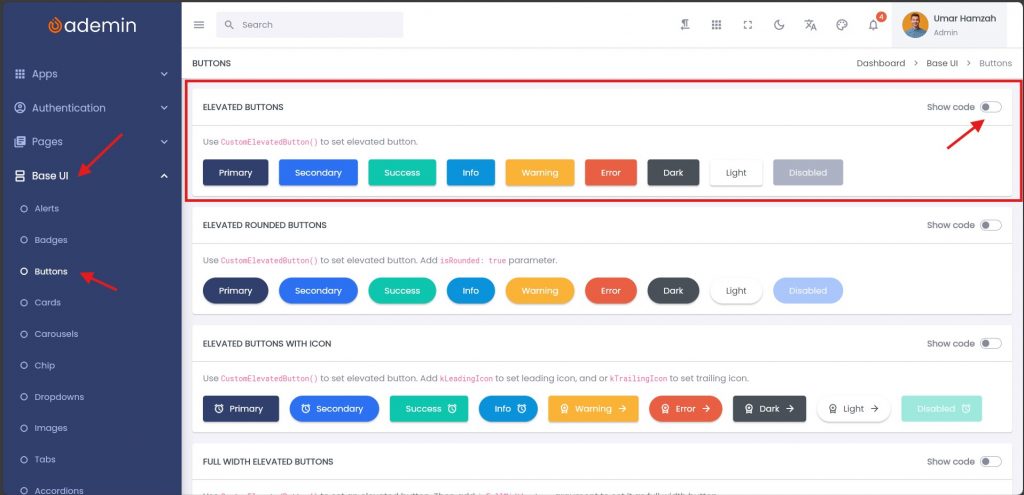
Step 2 — Toggle “Show code”
Enable the Show code switch.
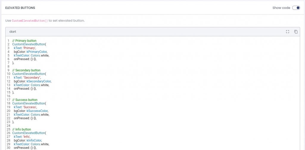
You will now see the underlying widget source:
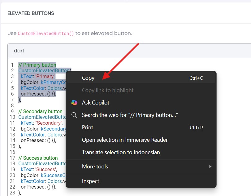
Step 3 — Copy and Paste the Code
Select the component you need and copy the snippet directly. Then paste it into your Flutter widget tree.
Step 4 — Import the Required FlutKit Widget
Import the required widget.
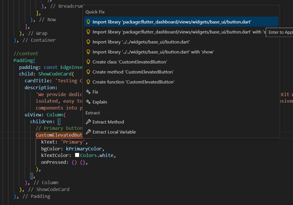
Tips: In Visual Studio Code, use the keyboard shortcutCtrl + .(Windows/Linux) or Cmd + . (MacOS) to trigger Quick Fixes and Suggestions, then selectimport library.
Step 5 — Customize as Needed
Because FlutKit widgets are designed to be developer-friendly, you can modify:
- Colors
- Text
- Icons
- Size
- Padding
- Shape
- Full layout structure
- Etc
This gives you freedom to adopt the UI component exactly as-is or adapt it to your design.
CustomElevatedButton(
  kText: 'Primary',              // The label text displayed on the button
  bgColor: kPrimaryColor,        // Background color of the button
  kTextColor: Colors.white,      // Text color for the button label
  onPressed: () {},              // Callback executed when the button is tapped
),