How to Customize The Footer
The Footer is displayed on every page of the dashboard layout. By default, it contains:
- the current year,
- the configured application name, and
- your company name.
This information automatically uses global configuration (inside AppSettings)—no need to manually update the year or branding every time.
However, developers can freely modify the footer, including adding custom UI such as links and social media icons. We have two types of footer:
- Portal Footer, used inside the authenticated/admin area of the dashboard.
- Public Footer, displayed on public-facing pages such as login, register, or landing screens.
1. Portal Footer Configuration
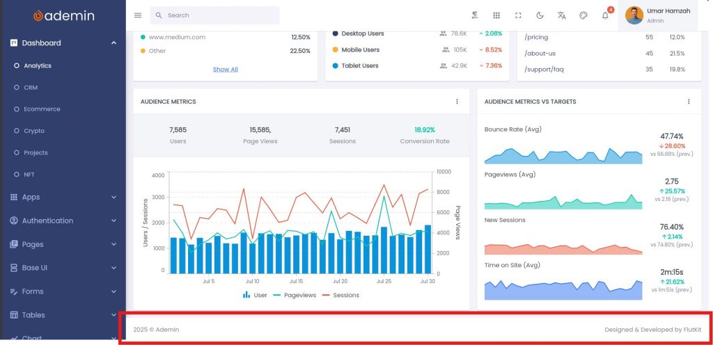
By default, the footer shows:
2025 © AppName Designed & Developed by CompanyNameTo configure the portal footer, open this file:
lib/configs/footer_config.dartInside, you will find:
class PortalFooterConfig {
  static List<Widget> widgets(BuildContext context) {
    final lang = Lang.of(context);
    final year = DateFormat('yyyy').format(DateTime.now());

    return [
      Text("$year © ${AppSettings.appShortName}"), // year & app name
      const Spacer(),
      Text("${lang.designedBy} ${AppSettings.companyName}"), // company name
    ];
  }
}Customizing Portal Footer Content
To customize the portal footer, you can add any widget you want—for example Text, Icon, or even a completely custom component.
Below is an example of how to add social media icons into the footer:
class PortalFooterConfig {
  static List<Widget> widgets(BuildContext context) {
    final year = DateFormat('yyyy').format(DateTime.now());

    return [
      Text("$year © ${AppSettings.appShortName}"),

      const Spacer(),

      // Facebook
      FaIcon(
        FontAwesomeIcons.facebook,
      ),
      SizedBox(width: kDefaultPadding),

      // X
      FaIcon(
        FontAwesomeIcons.x,
      ),
      SizedBox(width: kDefaultPadding),

      // Github
      FaIcon(
        FontAwesomeIcons.github,
      ),
    ];
  }
}In this example, the footer will automatically display the year and app name on the left, and your social media icons on the right.
Feel free to change icons, add links, or insert your own widgets—the footer will adapt dynamically based on the widgets you define inside the configuration file.
2. Public Footer Configuration
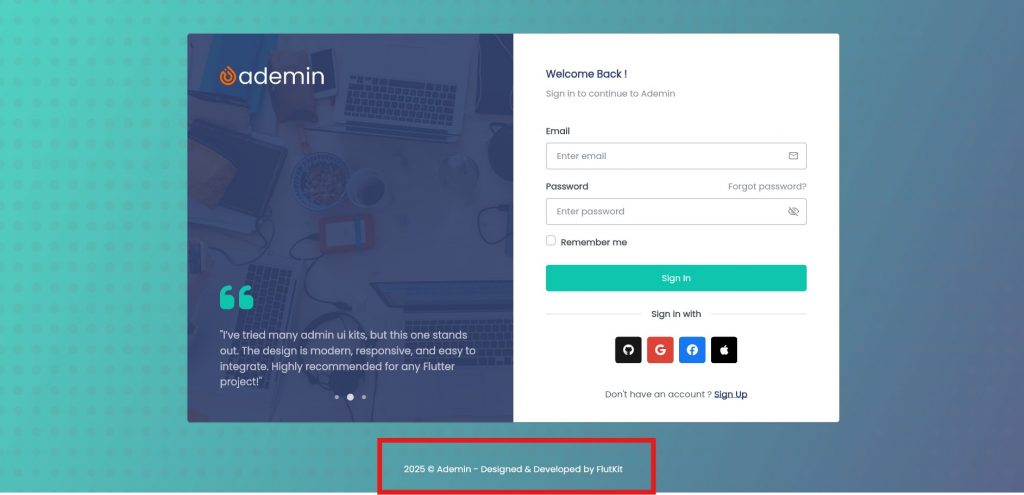
By default, the footer shows:
2025 © AppName - Designed & Developed by CompanyNameTo configure the public footer, open this file:
lib/configs/footer_config.dartInside, you will find:
class PublicFooterConfig {
  static List<Widget> widgets(BuildContext context) {
    final lang = Lang.of(context);
    final year = DateFormat('yyyy').format(DateTime.now());

    return [
      const Spacer(),
      // year & app name
      Text(
        "$year © ${AppSettings.appShortName} - ${lang.designedBy} ${AppSettings.companyName}",
        style: TextStyle(
          color: Colors.white,
        ),
      ),
      const Spacer(),
    ];
  }
}Customizing Public Footer Content
To customize the footer, you can add any widget you want—for example Text, Icon, or even a completely custom component.
Below is an example of how to add social media icons into the footer:
class PublicFooterConfig {
  static List<Widget> widgets(BuildContext context) {
    final year = DateFormat('yyyy').format(DateTime.now());

    return [
      const Spacer(),
      // year & app name
      Text(
        "$year © ${AppSettings.appShortName}",
        style: TextStyle(
          color: Colors.white,
        ),
      ),

      SizedBox(width: kDefaultPadding),
      // Facebook
      FaIcon(
        FontAwesomeIcons.facebook,
        color: Colors.white,
      ),
      SizedBox(width: kDefaultPadding),

      // X
      FaIcon(
        FontAwesomeIcons.x,
        color: Colors.white,
      ),
      SizedBox(width: kDefaultPadding),
      // Github
      FaIcon(
        FontAwesomeIcons.github,
        color: Colors.white,
      ),
      const Spacer(),
    ];
  }
}In this example, the footer will automatically display the year, app name and your social media icons at center.
