Optimizing Flutter Dashboard Admin Interfaces with Intelligent Responsive Layouts
In the era of multi-device applications, responsive design isn’t optional — it’s essential, especially for data-intensive screen patterns like Flutter dashboard admin panels that run across mobile, tablet, desktop, and web. A responsive layout ensures your admin UI scales gracefully no matter the screen size, offering a consistent user experience, fewer layout bugs, and faster development cycles.
One of the most effective tools in Flutter for crafting these responsive admin dashboards is ResponsiveWrap — a layout widget designed to intelligently rearrange content based on screen width and breakpoints. In this article, we’ll explore why ResponsiveWrap is a game-changer for Flutter dashboard layouts, how it works, and best practices to implement it for powerful responsive UIs.
Why Responsive Dashboards Matter in Flutter Admin Apps
Before we dive into ResponsiveWrap, let’s understand why responsive dashboards are crucial in Flutter admin UI development:
- Multi-Device Support: Dashboard admin apps are no longer confined to desktops. They’re accessed on tablets and phones — requiring responsive screens that show data intuitively.
- Complex Layouts, Dynamic Content: Admin dashboards often include tables, forms, cards, charts, and panels — all of which must maintain structure across varying widths.
- UX Consistency: Consistent layout across devices enhances usability, reduces cognitive load, and allows admins to focus on tasks rather than grappling with misaligned UI components.
Adaptive and responsive design principles help apps automatically reorganize widgets based on screen size rather than hard-coding layouts for each device. This flexibility is what distinguishes a good Flutter admin dashboard from a great one.
Introducing ResponsiveWrap: A Responsive Layout Widget
FlutKit — a production-ready Flutter UI kit focusing on dashboard and admin layouts — provides a powerful widget called ResponsiveWrap to tackle responsive content layouts without repetitive LayoutBuilder logic or complicated screen size checks. (flutkit.com)
The ResponsiveWrap widget intelligently:
- Automatically calculates and adjusts columns based on screen width or specified breakpoints
- Maintains consistent spacing and alignment
- Supports multi-column arrangements ideal for dashboard admin screens
- Eliminates the need for manual screen width checks or repetitive responsive logic
This makes ResponsiveWrap particularly useful when building admin dashboards with fluid content panels, metrics cards, forms, tables, and status widgets that need to change layout depending on width constraints.
How ResponsiveWrap Works: Key Concepts & Properties
Let’s break down what ResponsiveWrap does and how it functions under the hood:
🔹 Dynamic Columns via Breakpoints
ResponsiveWrap lets you define a set of breakpoints that map screen widths to the number of columns. For example:
ResponsiveWrap(
  breakpoints: {
    576: 1,
    768: 2,
    1024: 3,
  },
  children: [...],
);In this example:
- Width < 576: single column
- Width ≥ 576 and < 768: 2 column
- Width ≥ 768 and < 1024: 3 columns
- Width ≥ 1024: 3 columns because no additional breakpoints are defined, the number of columns for larger screen widths remains 3, following the last specified breakpoint.
This breakpoint system makes dashboards responsive without writing messy MediaQuery or LayoutBuilder checks.
🔹 Column Ratios for Flexible Layout Control
You can define relative column widths with the columnRatios property. This is especially helpful for admin screens where you need a main content area and a sidebar — for example, a 70/30 split:
columnRatios: [0.7, 0.3]This instructs ResponsiveWrap to allocate 70% width to the first widget and 30% to the second, adjusting fluidly based on screen size. (flutkit.com)
🔹 Spacing & Alignment Options
You can customize how widgets are spaced and aligned:
| Property | Purpose |
|---|---|
spacing | Horizontal spacing between items |
runSpacing | Vertical spacing between rows |
alignment | Horizontal alignment (start, center, spaceBetween, etc.) |
crossAlignment | Vertical alignment within rows |
This ensures your dashboard UI maintains visual balance regardless of screen dimensions. (flutkit.com)
Example: Responsive Dashboard Layout
Here’s an example of how you might structure a responsive admin dashboard layout using ResponsiveWrap:
ResponsiveWrap(
  breakpoints: {
    576: 1,
    768: 2,
    1200: 3,
  },
  columnRatios: [0.5, 0.2, 0.3],
  spacing: 16,
  runSpacing: 16,
  children: [
    DashboardCard(title: 'Sales Overview'), // 50% width
    DashboardCard(title: 'User Activity'), // 20% width
    AnalyticsChart(), // 30% width
  ],
);
This snippet creates a flexible grid of dashboard components. On mobile, it collapses into one column; on tablets, into two columns; and on desktop, into three columns.
Best Practices for Using ResponsiveWrap in Flutter Admin Dashboards
When integrating ResponsiveWrap into your dashboard UI, consider the following best practices:
1. Define Breakpoints that Match Your Design System
Instead of relying on generic screen widths, align breakpoints with your design system or component requirements. Common thresholds include mobile (< 600), tablet (600–1024), and desktop (> 1024).
2. Use columnRatios for Balanced Layouts
For panels like “main content + sidebar,” always pair columns with ratios to maintain visual hierarchy.
3. Avoid Deeply Nested Layouts Inside ResponsiveWrap
Keep each item inside ResponsiveWrap lean — too many nested widgets can complicate layout behavior and reduce performance.
4. Integrate with Your UI Component Library
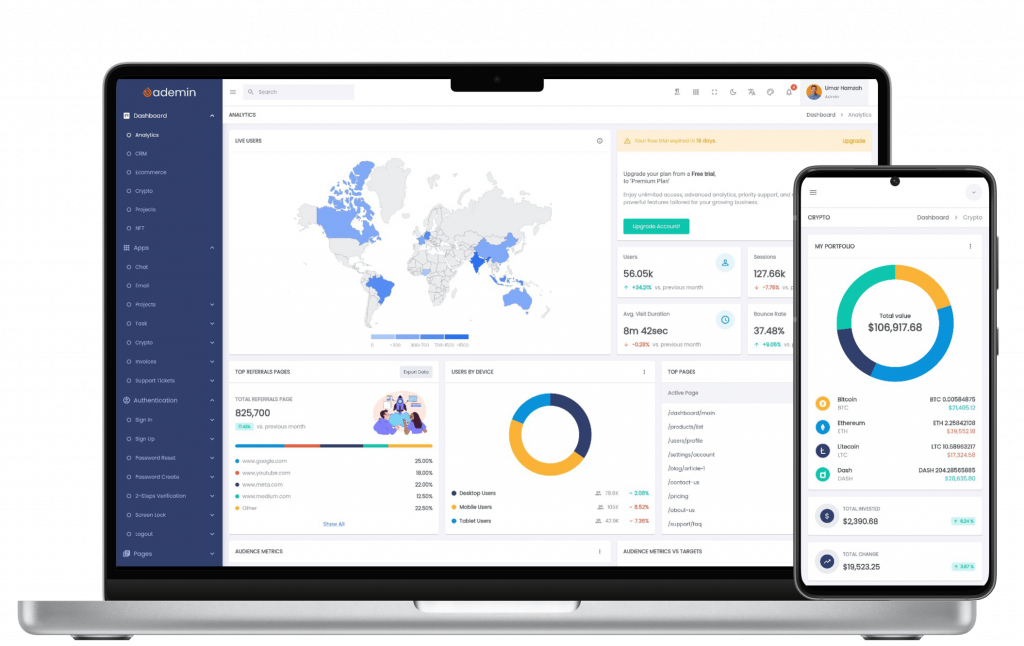
If you’re using FlutKit’s admin dashboard UI kit (like Ademin), pairing ResponsiveWrap with pre-built cards, tables, and charts ensures consistency and reduces development time. (flutkit.com)
ResponsiveWrap vs Traditional Responsive Methods
Traditional responsive design in Flutter typically involves:
- Using
MediaQueryto check screen size - Multiple
LayoutBuilderconditions - Separate layouts for mobile/tablet/desktop
While these methods work, they increase code complexity, require manually replicating logic, and can lead to inconsistent UI tweaks across screens. ResponsiveWrap abstracts this logic — you only declare breakpoints and behaviors.
Conclusion: Why ResponsiveWrap is Ideal for Flutter Dashboard Admin UIs
In modern Flutter admin dashboard projects, delivering responsive layouts should be straightforward. ResponsiveWrap brings powerful, declarative responsiveness to your UI — making multi-column layouts responsive, efficient, and easy to manage.
With clear breakpoint configuration, flexible column ratios, and spacing control — all without repetitive layout checks — ResponsiveWrap helps you build professional, scalable dashboards faster. Whether you’re building analytics screens, admin panels, or complex content grids, adopting ResponsiveWrap will elevate the responsiveness and polish of your Flutter dashboard admin UI.
Anda bisa menambahkan section baru di bagian akhir artikel sebelum Conclusion:
ResponsiveWrap Is Now Open Source
ResponsiveWrap originated from real-world requirements inside FlutKit dashboards. Rather than keeping it proprietary, we chose to release it as an open-source package so Flutter developers can benefit from the same responsive layout techniques used in production dashboard applications.
Try ResponsiveWrap:
The package is lightweight, easy to integrate, and designed specifically for responsive Flutter layouts.