In the modern era of software development, the demand for cross-platform capability has never been higher. Flutter, Google’s UI toolkit, has emerged as a frontrunner not just for mobile, but increasingly for web and desktop applications. When building internal tools, SaaS platforms, or enterprise management systems, the dashboard serves as the nerve center.
However, building a high-quality dashboard from scratch is a monumental task. This is where a Flutter dashboard UI kit becomes indispensable. But not all kits are created equal. To truly accelerate development and provide a premium user experience, certain Flutter widgets and architectural patterns must be present.
In this guide, we will explore the essential components every Flutter dashboard UI kit must include to be considered professional-grade.
The Foundation: Why Components Define Dashboard Quality
A dashboard is only as good as its individual parts. Unlike a simple landing page, a dashboard is a high-utility environment. Users don’t just “view” a dashboard; they interact with it, filter it, and rely on it for critical decision-making.
Quality Flutter dashboard components provide three main benefits:
- Consistency: Ensuring that a button on the profile page behaves exactly like a button on the settings page.
- Scalability: Allowing developers to add new features without breaking the existing layout.
- Performance: Optimized widgets ensure that complex data visualizations don’t lead to frame drops or lag.
Layout System & Navigation
The layout is the skeleton of your application. In Flutter, creating a responsive layout that works on a 13-inch laptop, a 27-inch monitor, and a mobile phone requires a sophisticated approach to Flutter widgets.
The Responsive Grid
A professional UI kit must include a responsive grid system. Most dashboards utilize a 12-column grid layout, similar to Bootstrap, adapted for the Flutter LayoutBuilder and MediaQuery. This allows components to wrap or resize based on the screen width.
Navigation Rails and Sidebars
Navigation is the most frequent interaction point. A top-tier kit should offer:
- Persistent Sidebars: For desktop views, allowing quick access to different modules.
- Collapsible Drawers: To save screen real estate when the user is focused on data.
- Bottom Navigation: Specifically for mobile users to maintain thumb-reachability.
The Breadcrumb System
As dashboards grow in complexity, users can easily get lost in nested menus. A breadcrumb component is essential for showing the user’s current location and providing a one-click path back to parent categories.
Charts & Data Visualization
The primary goal of most dashboards is to make sense of complex data. Therefore, Flutter charts are arguably the most important secondary keyword in any developer’s search. A UI kit without robust visualization is merely a collection of forms.
Essential Chart Types
A comprehensive kit must include:
- Line & Area Charts: For tracking trends over time (e.g., monthly revenue or user growth).
- Bar & Column Charts: For comparing categories (e.g., sales by region).
- Pie & Donut Charts: For showing proportions and percentages.
- Scatter Plots: For identifying correlations between two variables.
Interactivity is Key
Static images of charts are not enough. High-quality Flutter dashboard components should support tooltips on hover/tap, zooming, and legend toggling. This allows the user to drill down into specific data points without leaving the page.
Performance Optimization
When dealing with thousands of data points, standard Flutter painting can become heavy. A great UI kit uses optimized libraries (like fl_chart or custom-painted widgets) that handle large datasets without stuttering, utilizing RepaintBoundaries effectively.
Data Tables & Listings
If charts provide the “big picture,” data tables provide the “nitty-gritty.” Most enterprise applications are essentially sophisticated interfaces for interacting with databases.
Key Features of Flutter Data Tables
Standard DataTable widgets in Flutter are often too basic for professional needs. An essential UI kit should enhance these with:
- Pagination: Crucial for performance when handling hundreds of rows.
- Sorting & Filtering: Allowing users to find specific entries based on date, status, or name.
- Sticky Headers: Keeping the column titles visible as the user scrolls through long lists.
- Bulk Actions: Checkboxes that allow users to delete, export, or edit multiple rows simultaneously.
The “Empty State” Design
A common oversight is the lack of an “Empty State” component. When a search returns no results or a table has no data, the UI kit should provide a clean, branded illustration and a “Call to Action” (CTA) to add new data.
Forms & Validation
Dashboards aren’t just for reading; they are for data entry. Whether it’s creating a new user profile or configuring system settings, the form components must be flawless.
Input Variety
Beyond standard text fields, a robust kit includes:
- Date & Time Pickers: Custom-styled to match the dashboard theme.
- Multi-select Dropdowns: With search functionality for long lists.
- Switch and Toggle Buttons: For binary settings.
- File Uploaders: With progress bars and drag-and-drop support.
Validation Logic
A professional kit provides pre-built validation logic for common fields like emails, passwords, and URLs. This ensures that the user receives immediate feedback before they even hit the “Submit” button, reducing server-side errors and improving UX.
Notifications & Messaging
A dashboard is a living ecosystem. Users need to be alerted when a process completes, an error occurs, or a new message arrives.
Feedback Mechanisms
- Snackbars & Toasts: For non-intrusive feedback (e.g., “Changes saved”).
- Modals & Dialogs: For critical actions that require user confirmation (e.g., “Are you sure you want to delete this?”).
- Badge Systems: Small numeric indicators on icons (like a bell or envelope) to show pending notifications.
Status Indicators
Color-coded tags (Success, Warning, Error, Info) are essential for glanceability. A “Success” tag in green or a “Pending” tag in amber helps users process information faster than reading text alone.
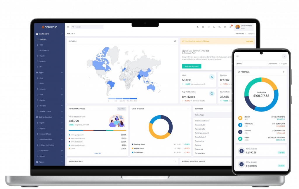
How FlutKit Covers All Essentials
When searching for a solution that checks all these boxes, FlutKit stands out as a premier choice for developers. Built with the specific needs of modern software engineers in mind, it goes beyond basic UI and provides a comprehensive ecosystem for dashboard development.
Ready-to-Use Dashboard Templates
FlutKit doesn’t just give you a box of parts; it gives you the blueprints. With pre-built layouts for e-commerce, analytics, and project management, you can skip the “blank page” phase and move straight to logic.
Extensive Widget Library
FlutKit boasts a massive collection of Flutter widgets, including specialized versions of all the components mentioned above. From advanced Flutter charts that are easy to customize to highly responsive Flutter data tables, the kit is designed to be “plug-and-play.”
Clean Architecture
One of the biggest hurdles with UI kits is “spaghetti code.” FlutKit is built with clean, modular Dart code. This makes it easy to customize the theme, change the primary colors, or integrate your favorite state management solution like Provider, Bloc, or GetX.
Best Practices for Implementing a Flutter UI Kit
Once you have chosen a high-quality kit like FlutKit, follow these best practices to ensure a successful build:
- Keep it Atomic: Use the kit’s atomic components (buttons, inputs) to build your larger molecules. Don’t hard-code styles that the kit already provides.
- Prioritize Accessibility: Ensure that your color contrasts are high enough and that touch targets are large enough for all users.
- Optimize Asset Loading: Dashboards often use many icons and illustrations. Ensure you are using SVG or optimized font icons to keep the app size small.
- Test on Multiple Screen Sizes: Always use the Flutter “Device Preview” or resize your browser window constantly during development to ensure the responsive layout holds up.
Conclusion
Choosing the right Flutter dashboard components is the difference between a tool that users tolerate and a tool that users love. By ensuring your UI kit includes a responsive layout system, powerful data visualization, robust tables, and intuitive forms, you set your project up for long-term success.
A well-constructed dashboard reduces cognitive load, increases productivity, and reflects the professional quality of the underlying software. With a comprehensive solution like FlutKit, you gain access to years of UI/UX expertise packed into a single, developer-friendly package.
Ready to build your next world-class dashboard? Don’t waste hundreds of hours on basic UI components. Explore the full library of widgets, layouts, and charts designed specifically for high-performance Flutter applications.